Wednesday, December 22, 2010

"Another year is over & what have we done?" -John Lennon

I should for warn you, I have a bit of melancholy today. I don't know exactly why. This happens at this time of year though, doesn't it? The weeks leading up to Christmas are full of hustle and bustle in a carpet store. The sales reps bring wonderful sweets, the most special ones being homemade. We talk and take the time to reflect on how lucky we are to have survived an exceptionally challenging year. I feel fortunate to work in such a lovely environment with wonderful people. It's no joke that Mike and I really do care about making our customers happy with the area rugs or carpets we provide. I am thrilled to be working in a true locally owned and operated business, and so I'm including more photos of the store- Thank You, Sandrine  Arons for your photos! Keep and eye and ear out for our next adventure here at Moore Floor Coverings, for we plan to expand by offering roll goods and create an even more special shopping experience. Hugs & Kisses, Sloane


The very Italian Redici Circles.

Sisal rug options are endless and these natural rugs have become classic.

Our texture wall. Come cozy up.


Gorgeous pattern and colors- perfect for the dining room.

She keeps watch.

One my truly favorite shots. I love the natural edge. It's Abbaca.

The custom carpet options are endless at Moore Floor Coverings.

Love these "embossed" patterns by Bellbridge.

Have I posted this one before? Geomtrics are everywhere.Get on the band wagon people.


Wednesday, December 8, 2010

One last stripe post for the year


I know that I just posted an image of a stripe carpet (the lovely in my dining room) but here ya go one more striped post for 2010 (can not believe this year is almost over, can you?) for good measure. I just find the stripe such an easy pattern. This look can go in just about any room of the home, can be dramatic, classic, modern, country, fun and most are quite 'forgiving'- very good for our busy lives. 


 I love the simplicity of this design and the mix up of pieces and the cocoa brown rug w/ creamy stripes is quite handsome.Love the calendar thingy too.


Woodward Weave,
reminds me of the gorgeous Elizabeth Eakins rug in Something's Got to Give


just for the nerve of it- a crazy cool missoniesque carpet


Love the stairs, carpets and the rose vine pruned in to a wreath.


Gyun Hur a recent recipient of the Hudgens Center for the Arts prize; 
does art imitate design or design imitate art...
I say it's a mutual relationship.

LOVE LOVE LOVE Rosalind Russell's blazer and hat!

*thanks for visiting*


Tuesday, November 23, 2010

What A Difference A Floor Makes

Patra in Northern Lights by Couristan makes a stylish, forgiving dining room area rug.
Architectural Digest always has the most elegant, well designed homes. The owners of the featured homes are usually super stars in their fields and thus have super star pocket books. One will not find 'repurposed' materials in this magazine. I am struck by how the use of patterned carpet and area rugs, some made custom for the rooms, make a huge difference in a space. It's become such the trend to neutralize the floor of a room in sisal or a look alike, as if the room's foundation is an after thought or should act as a blank canvas.  I'm almost shocked to see otherwise. But what a difference it makes. Especially when everything else is neutral. In my own tiny apartment home, I recently installed (er, the husband) a very colorful striped area rug from  Couristan. I was so hesitant to go for the color, afraid of the small space becoming too busy, but after trying to work with two very neutral area rugs, the first jute and then a jute/ sisal colored wool, I went for it. The space is my dining room and with a two year old and two messy semi slack adults the floor always gathers messes of living. The wool always cleans wonderfully but who has time- or the desire- to clean one's carpet in her 'free time.' So, now the striped rug- still low profile and wool- forgives or messes until I take the time to remove them (or call our dear friend and associate, Terry Hunt who can clean carpets and rugs in a flash and he is a lovely person to boot!) And boy was I wrong about looking to busy for the room- it makes the room!

 This hand tufted  Bink & Campman area rug reminds me of Libby Sims Patrick's Dining Room featured in Novembers Better Homes and Gardens. This rug is available in 4'7 x 6'7" , 5'3" x 7'6"  , 6'7" x 9'2" and custom sizes.

Oliver Stone's Red, White and Blue NYC apartment. This custom rug makes this room.
And here's the other half of that room, scanned in from October's Architectural Digest.  


Gloria Vanderbilt's NYC apartment featured in an October issue of New York magazine. I post this one for the absolute bravery of it. Most of us would not normally place what appears to be a blue and cream rug off of the very red space. But it is the contrast, or the irony, that makes this a fabulous choice. A sisal certainly would work, but why do that if you can do this?


Wednesday, November 3, 2010

Is America in Her Blue Period?


"Colorists say blue is a relaxing color. Pleasant dreams might be the end result of coloring the bedroom in shades of blue. It has a calming effect on the body: it lowers blood pressure, heart rate and respiration and in hot, humid weather has a cooling effect. Another study shows that blue in the classroom can be a good thing. Children prone to tantrums and aggressive behavior became calmer after being in a classroom painted blue. Both blind and sighted children reacted the same when placed in blue surroundings."- from HGTV's website

I'm often surprised at how much a color can effect me. Emotionally even. Does this happen to you? Each subtle shade and all of its different hues evoke emotions or memories. Color can effect me much the way a wonderful piece of music or a favorite movie does. The TV show Mad Men constantly moves me and I am often surprised by my affect after watching an episode. I think it is partly due to the dynamite design of the thing (exquisitely appropriate to the period). I know, I know. This show is much blogged about, and I am certain that I will blog in the future about Mad Men- I can't help myself. I love it. 

Blue has been an important color in Mad Men. The first Season shows Betty Draper in a very 1960's blue coat and the Draper's powder blue tufted headboard in their Master Bedroom reminds me of a bridal blue. Moody blue remains present throughout each episode, sometime it's in the background, sometimes its on a dress. In season four the new office colors are a bit younger, more modern, brighter. There is deep blue furniture outside the Don Draper's office. The fabric is almost a Mediterranean Sea blue. A perfect color for this protagonist poses as controlled and calm. But the viewer sees his moody blues.

In decor blue is easy. Non-competing. Complementary to so many other colors. A stable color that can embrace without suffocating, creating an environment where one can open up. Perhaps this is what America needs right now, stability with a side creative freedom. I am not saying I have the answers or that I would reveal them here, but the color sure is popping up as of late.-Sloane

this and the pic above are vintage House Beautiful (from website), posted via Mad Men inspiration


love this blue wool and cream silk area rug, very mid-century pattern, avail in standard sizes

Early in his career Picasso utilizes blue as a healing salve to make over wounds that a friend's death inflicts. 
Miles Davis composes subtle tonal switches in the monumental Kind of Blue.


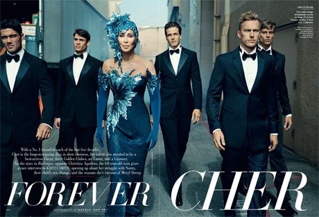
from Vanity Fair magazine


Blue Ralph Lauren's latest fragrance, plus check out the classic American designer's blue label
 Jonathan Adler's NYC apartment from The Wall Street Journal;
this stair carpet reminds me of a David Hicks carpet we carry.


Thursday, October 28, 2010

What's New This Month

We have definitely seen a turn in the design world to a more modern aesthetic. Atlanta's designers and home owners are using more transitional patterns with cleaner lines, though with some resistance for we are such a traditional market. Here are a few of the new carpet styles we've received at Moore Floor Coverings referencing trends in the geometric fashion.

Langhorne does this B/W large basket weave smartly with the gray in the background, don't ya think?


This is a new embossed large diamond trellis. My picture does not do it justice. The background is a flat weave type look. Anyway, I love this look... good for the traditional or the modern home.

A fresh Wilton pattern in subtle colors. I really should post the neutrals in this pattern, for they have a rich tobacco colorway.

A take on a well loved diamond pattern in a nubby wool. We are seeing this look quite a lot now.

Well, my picture has this sample doing The Wave... an 80's dance move for a modern look. This is undyed wool. A trend slow to catch on in the Atlanta area but if you have a green minded client something like this is just the ticket baby!
 Thanks for visiting and your interest in Moore Floor Covering. xo- Sloane

Monday, October 18, 2010

Moore Showroom Snap Shots

The Gallery at Moore Floor Coverings
 Here are a few random photographs of the store. Many of these sample displays have already changed, however because new samples arrive daily here at Moore Floor Coverings. Happy browsing! -Sloane
Gorgeous colors made with a cool fusion bonded application.


 These lovey little pockets are wool and abaca from The Natural Carpet Company's made to order collection.
Custom colored and patterned area rugs are a big part of what we do here at Moore Floor Coverings. 


"Flat Weaves" are carpets that are very low profile and read a lot like a sisal but are smoother. Available mostly in wool, linen and a few polypropylene or olefin options.


Thanks so much for visiting. Come again soon!